0 1 0 1 2 3 4 5 6 7 8 9 0 0 1 2 3 4 5 6 7 8 9 0

Case Study, Web Design

Computer Aided Design Studio

The company Computer Aided Design Studio (CADS) aims to create a website. The company specializes in PLM (Product Lifecycle Management) and BIM (Building Information Modeling) solutions, in addition to offering online courses. The project's goal is to provide users with an intuitive and efficient website that helps them easily find information about CADS' services and enroll in courses.

The Problem

Users face difficulties navigating the current Computer Aided Design Studio website due to its disorganized and unintuitive structure. Additionally, the course enrollment process is complex and confusing, resulting in high drop-off rates.

The Goal

The goal was to enhance the user experience by making the website more accessible, organized, and user-friendly, simplifying the course enrollment process, and ensuring that PLM and BIM solutions are clearly communicated and easy to find.

User Research

To understand user needs and challenges, I conducted user research involving funnel analysis and collected direct user feedback. This approach provided valuable insights into how users interact with the current site and what improvements were necessary.

Information Overload and Technical Complexity

We examined user behavior through funnel analysis, which allowed us to track how users move through various stages of the website. This helped identify where users drop off and which stages of their journey might be causing friction.

User Feedback

We collected direct feedback from users to gain insights into their experiences. This involved surveys, interviews, and feedback forms to understand their challenges and expectations.

User Insight

Based on our comprehensive user research, we gained several crucial insights into the challenges and needs of users interacting with CADS' current website. These insights reveal significant areas for improvement and provide a clear direction for enhancing user experience. Below, we summarize the key findings that highlight both the pain points users face and their expectations from the website.

Navigation Challenges

The disorganized site structure makes it difficult for users to find relevant information.

Complex Course Enrollment

Professionals need more accessible information on how these solutions can improve project efficiency.

Need for Clear Integration of PLM and BIM Solutions

Professionals need more accessible information on how these solutions can improve project efficiency.

Desire for Improved Educational Resources

Users seek intuitive interfaces and streamlined access to courses and educational materials.

Persona

Journey Map

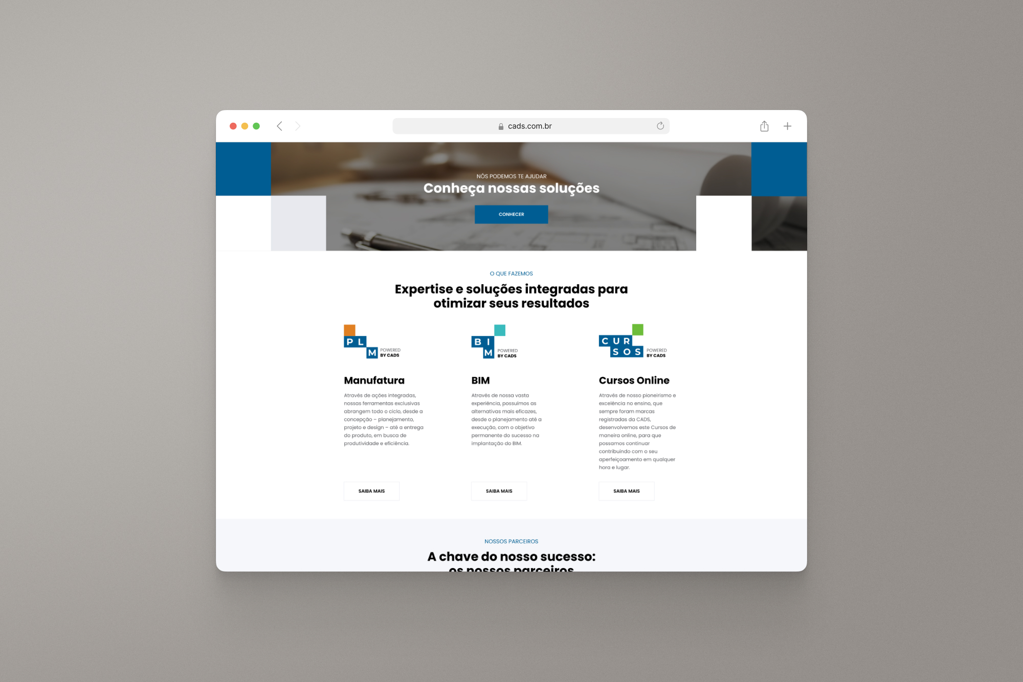
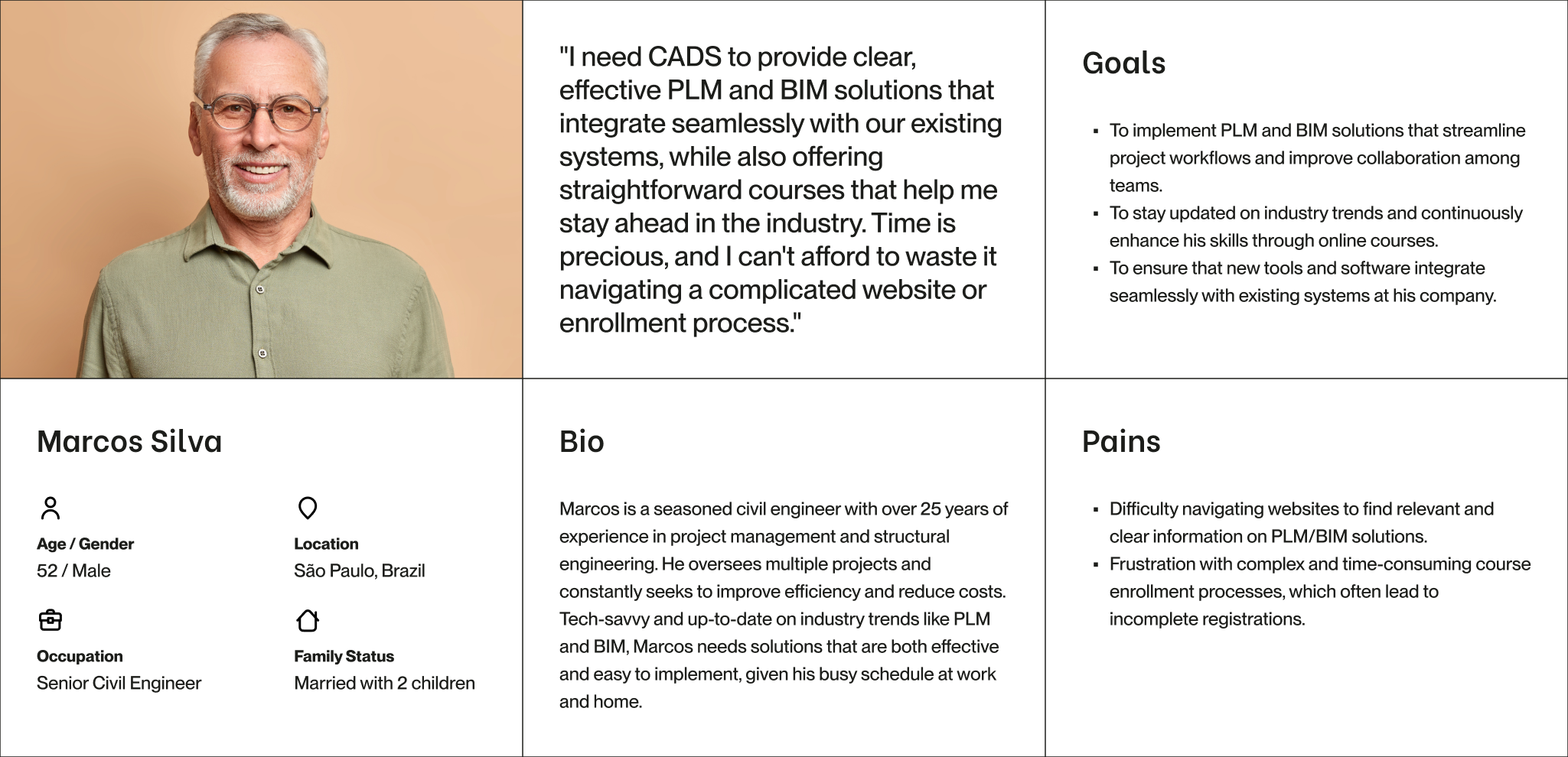
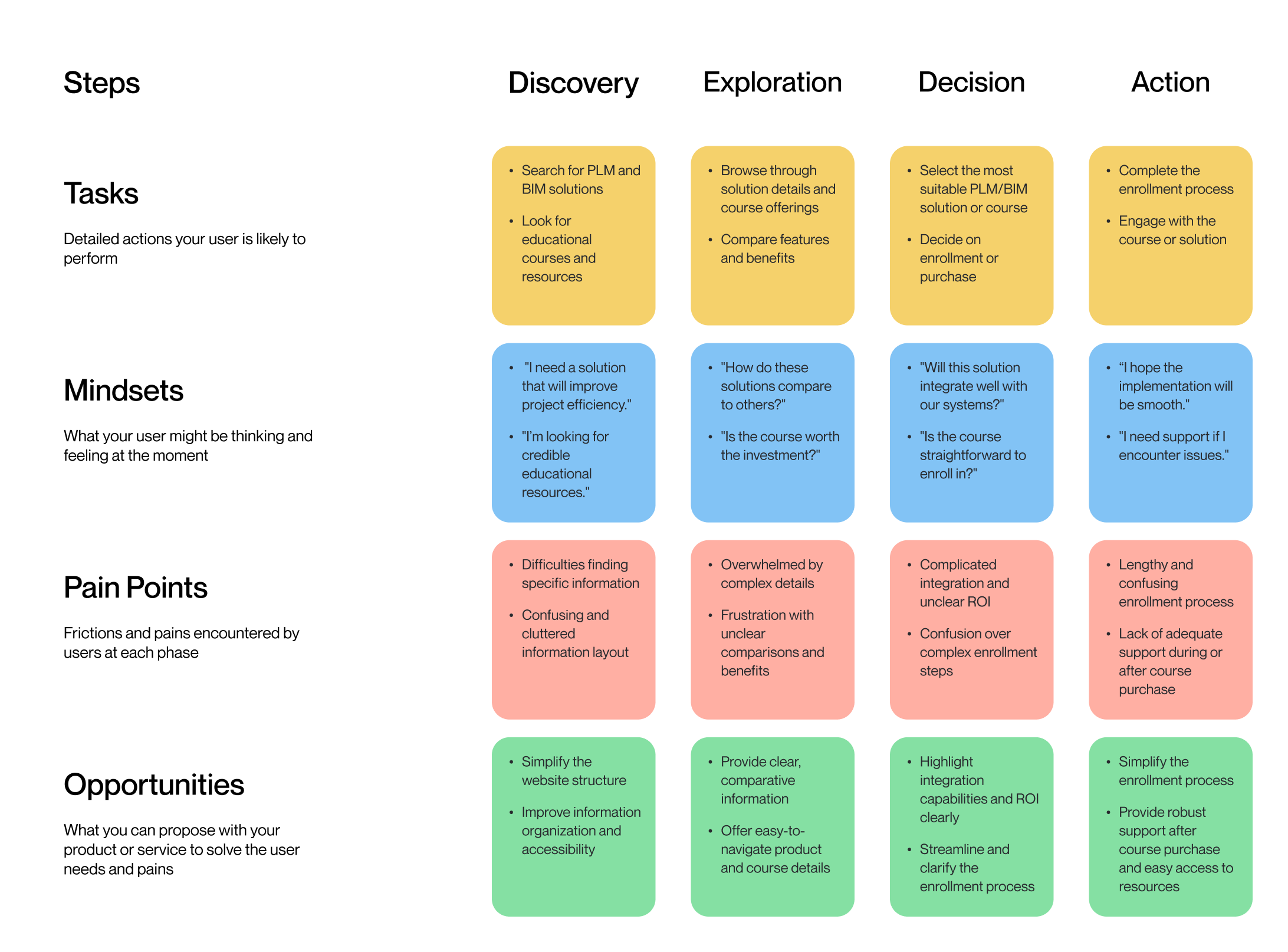
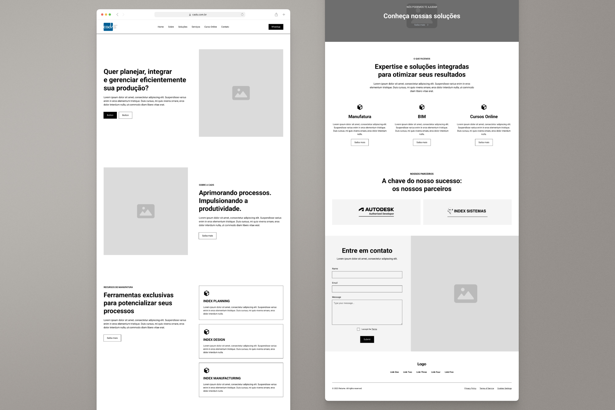
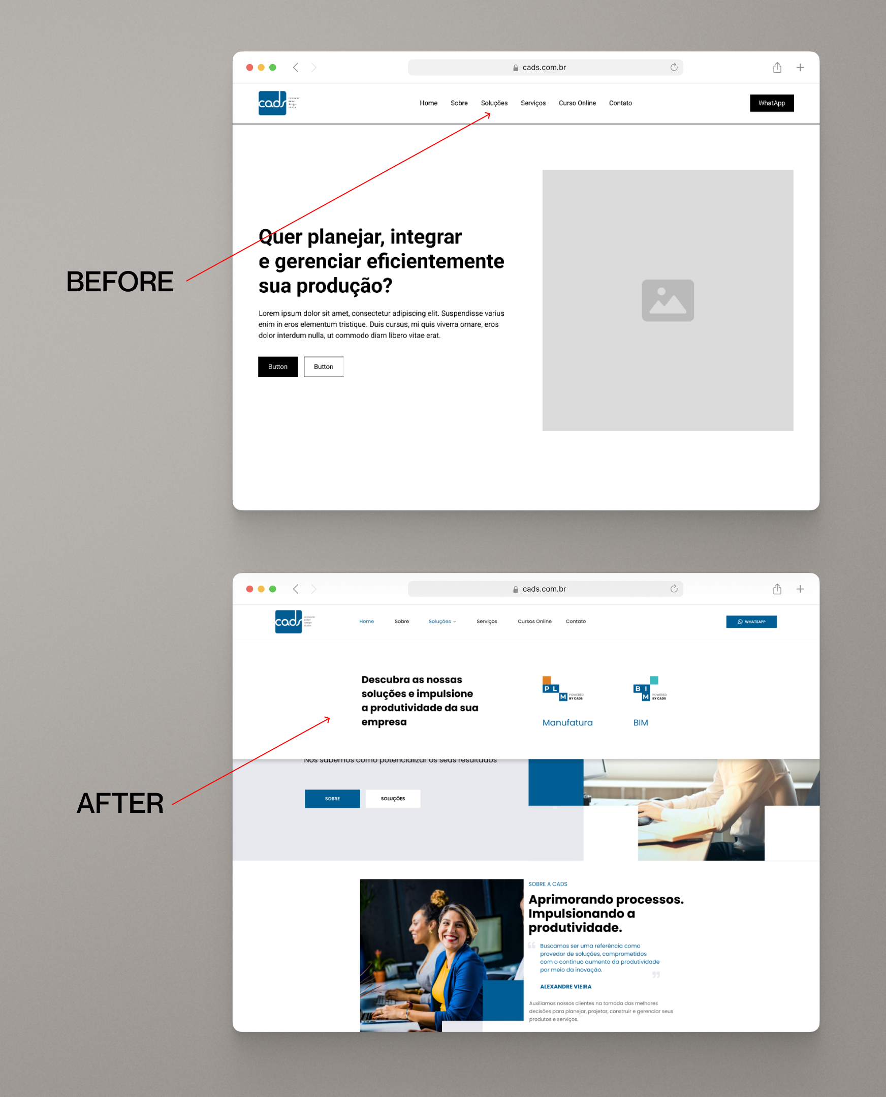
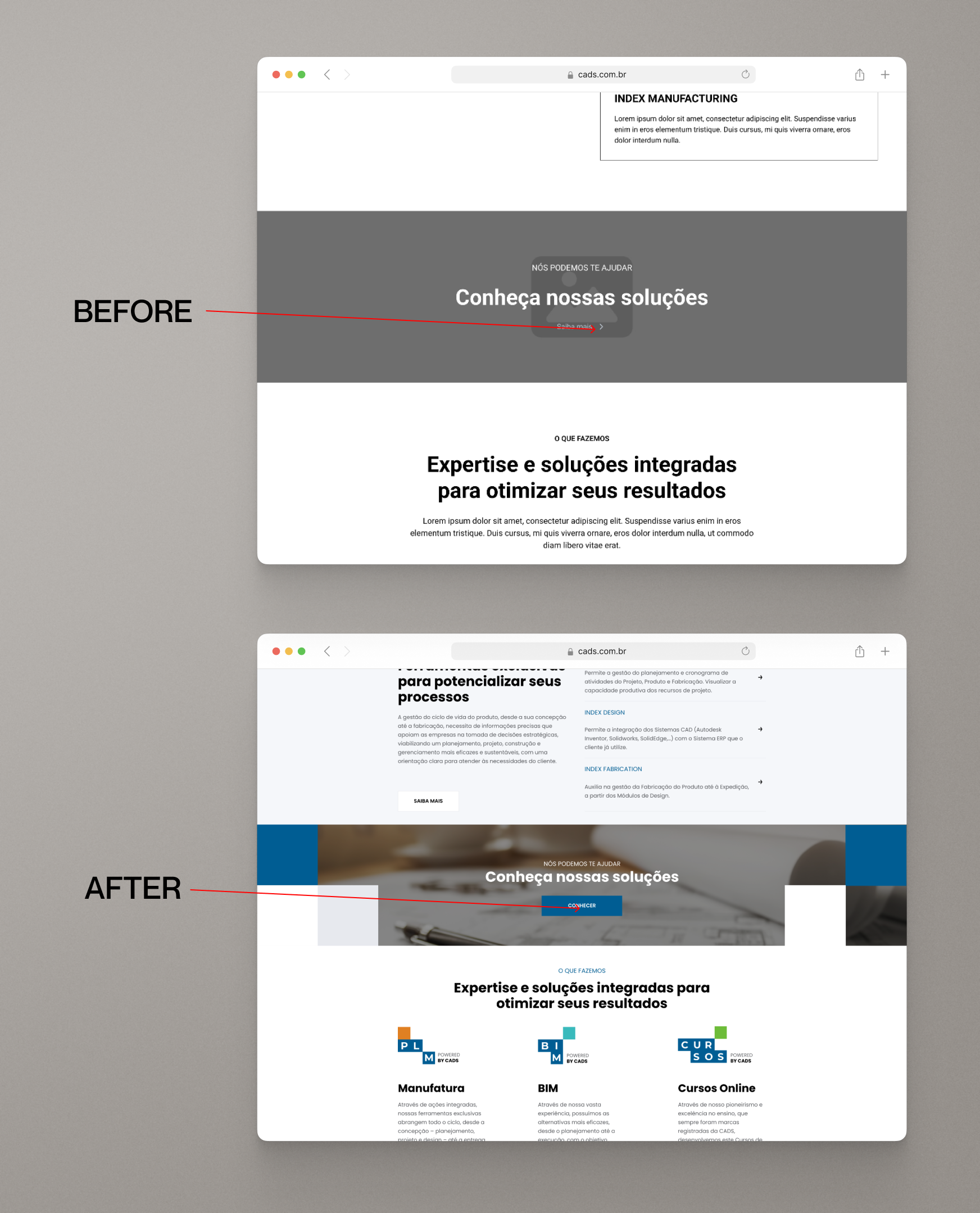
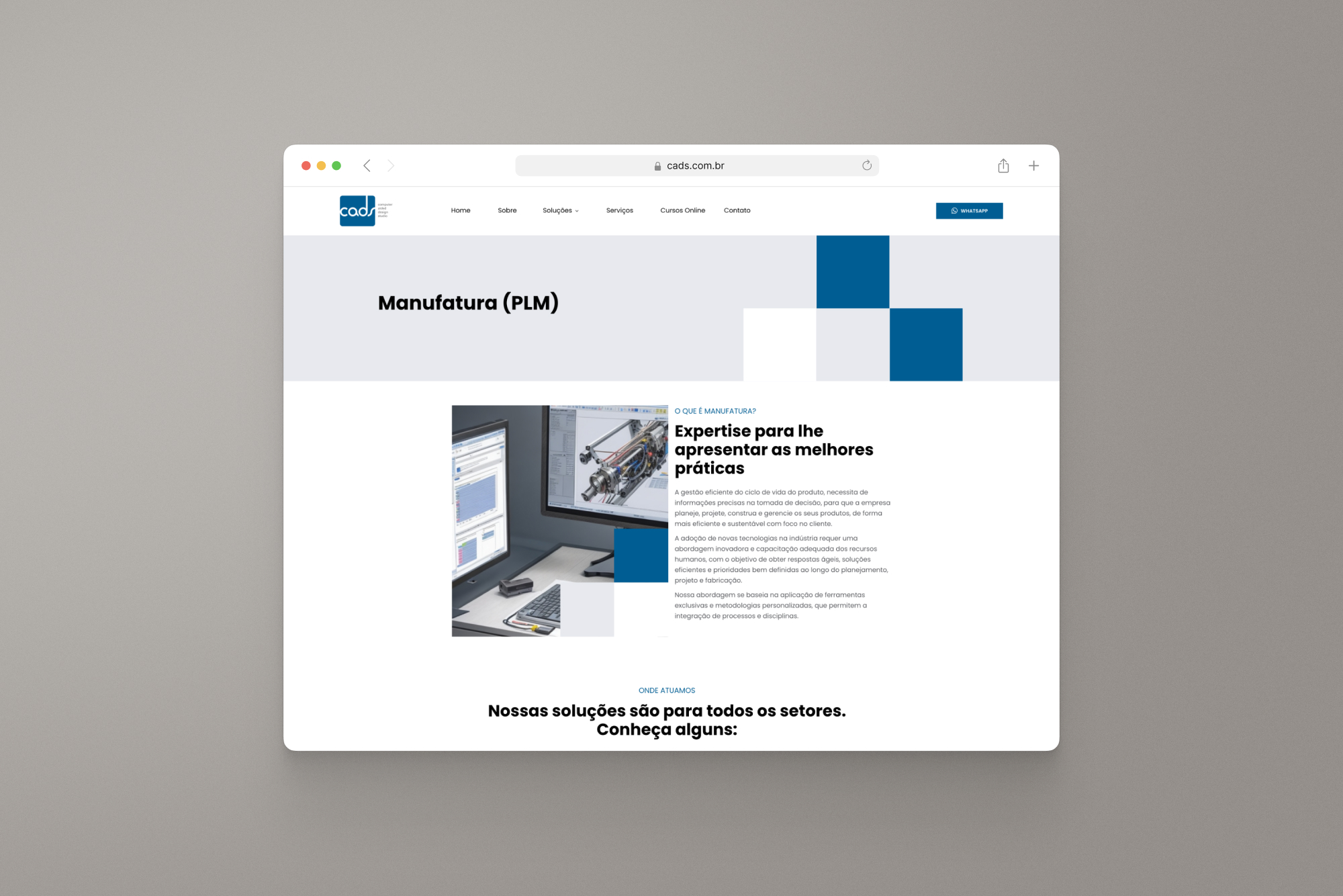
The User Journey Map illustrates the key stages that users like Marcos Silva, a Senior Civil Engineer, go through when interacting with CADS' website. From discovering PLM and BIM solutions to making decisions and taking action, this map highlights the detailed tasks users perform, their mindsets at each stage, the pain points they encounter, and the opportunities CADS has to enhance their experience.

Wireframe

The wireframe was designed to improve usability by reorganizing information and enhancing navigation. Key features included a simplified layout, clearer CTAs, and an improved structure for content related to PLM, BIM, and courses.

User Testing

After conducting the user test with the homepage wireframe, I received the following improvement suggestions:

1. Enhance Navigation and Information Hierarchy

Reorganize the navigation bar to make the sections for PLM, BIM. Including dropdown menus could help users quickly find the information they need, reducing the frustration caused by the current structure.

2. Simplify Call-to-Actions (CTAs)

Make action buttons like "Learn More" and "Explore" more visible and intuitive. Use contrasting colors and position them consistently throughout the page to guide users easily through their desired actions, such as exploring solutions or enrolling in courses.

Style Guide

The final design uses two shades of blue for professionalism, complemented by black, white, and gray for contrast and readability. Poppins typography and intuitive icons were selected to create a modern, user-friendly interface that supports easy navigation and enhances the overall user experience.

Site Developed

I crafted a streamlined website for CADS that balances clarity and modern aesthetics. The design improvements aim to provide a seamless user experience and effectively showcase CADS' PLM and BIM solutions and educational content.

What I Learned and Impact

Through this project, I learned the importance of aligning design elements with user needs to create a more intuitive and effective website. The redesign not only improved user navigation and engagement but also reduced friction in course enrollment, leading to a more satisfying user experience overall. The impact of these changes is evident in enhanced user satisfaction and increased efficiency in accessing CADS' offerings.

NEXT PROJECT

Global Intelligence Unit

Web Design