The Psychology of Color in Web Design and Its Impact on Branding
The Psychology of Color in Web Design and Its Impact on Branding
Have you ever wondered why certain websites leave a lasting impression, while others fade from memory? The secret may lie in the vibrant world of color. In the realm of web design, color isn’t just a cosmetic choice; it’s a psychological tool that can steer emotions, prompt actions, and sculpt perceptions. In this journey through the spectrum, we’ll explore how color psychology transforms simple web designs into powerful brand statements.
The Power of Color in Web Design
Colors speak louder than words, silently influencing our thoughts and feelings without us even realizing. Imagine walking into a room painted in stark white versus a comforting shade of blue. Would your emotions differ? Absolutely! This unspoken language of colors is pivotal in web design, where creating the right first impression is key.
Colors and Emotional Responses
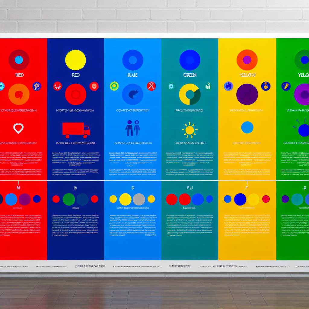
Each color can evoke a different emotional response. Red can quicken your pulse with its intensity and passion, while calm blue can lower it, offering tranquility. Web designers employ this emotional palette to craft sites that not only attract but also connect with users on a deeper emotional level.
Color as the Voice of Brand Personality
Just like individuals, brands exude personality, often communicated through their color palette. A vibrant red may shout ‘energetic and dynamic,’ while a serene green whispers ‘natural and calming.’ Aligning color with a brand’s personality creates harmony and aids in establishing a relatable and memorable brand presence.
Brand Identity Through Color Associations
Think of iconic brands—McDonald’s golden arches, Starbucks’ green siren, or Coca-Cola’s festive red. These colors aren’t arbitrary; they embody each brand’s essence. McDonald’s uses red and yellow to stimulate appetite and speed, reflecting fast food’s core. This clever use of color psychology reinforces brand identity and ensures consumer recognition.
Color Palettes for Diverse Brand Personalities
- Vibrant and Bold: Incorporate shades of red and orange.
- Trustworthy and Dependable: Use blues and greys.
- Luxe and Elite: Embrace purples and blacks.
- Eco-Friendly and Natural: Opt for greens and earthy browns.
Selecting the Right Colors: A Strategic Decision
Choosing colors for web design isn’t just about instinct; it’s about strategy and understanding the target audience. The perfect palette enhances user experience and aligns with brand messaging to drive engagement and loyalty.
The Psychology of Web Color Choices
Web designers understand that colors guide users seamlessly through a website. The right combination can highlight action buttons, improve readability, and create an intuitive navigation system. A well-crafted color scheme acts like a visual GPS, guiding the visitor through the digital landscape.
The Importance of Color Contrast
Contrast is critical for clarity and focus. By strategically using contrasting colors, designers can spotlight essential information, drawing users’ attention effectively, much like a lighthouse guiding ships safely to shore.
Cultural Interpretations of Color
Color significance often varies between cultures—what conveys positivity in one culture might carry negative connotations in another. Brands with a global audience must navigate these differences to avoid cultural blunders.
Cultural Color Connotations
For example, while white symbolizes purity and weddings in Western cultures, it is associated with mourning in parts of Asia. Understanding these nuances is crucial for creating culturally sensitive web designs that resonate worldwide.
Color Testing: Ensure Effectiveness with A/B Testing
Like culinary tastings, testing color effectiveness can distinguish winning palettes. A/B testing allows designers to experiment with different color schemes and gather data on user engagement and preference.
Implementing A/B Testing
A/B testing involves presenting two versions of a webpage—each with a different color scheme. Analyzing user interactions and success metrics reveals which set up resonates best with your audience, allowing for informed design decisions.
Success Stories in Color Psychology
Explore how leading brands have used color psychology to enhance their web presence and bolster recognition. These case studies illuminate the impact of strategic color use.
Starbucks and Its Inviting Green
Starbucks chose green to signify growth, freshness, and relaxation, aligning perfectly with their global mission of nurturing the human spirit. The soothing palette invites customers into a space of comfort and leisure, reinforcing the brand’s welcoming ethos.
Apple’s Clean White Design
Apple’s minimalist white coupled with sleek metallics underlines innovation and simplicity. This choice reinforces Apple’s brand philosophy—clean, efficient, and cutting-edge—creating a consistent global image that resonates across cultures.
The Dangers of Color Missteps in Web Design
While colors can enhance, they can also distract if misused. Avoid these common pitfalls to ensure your color choices serve your brand’s goals.
Pitfalls of Overusing Colors
Too many competing colors can create visual chaos, much like a cacophony in a serene environment, distracting and overwhelming the user.
Color Blind Accessibility Concerns
Accessibility should be top of mind; around 8% of men and 0.5% of women experience color blindness. Utilize textures or patterns in conjunction with color to ensure that everyone can navigate your website successfully.
Tools to Craft Perfect Color Palettes
Designers have numerous tools at their disposal to aid in the selection of perfect color combinations, turning ideas into impactful visual realities.
Essential Color Design Apps
- Adobe Color: A powerful app for generating and experimenting with color schemes.
- Coolors: A tool offering an easy-to-use interface to quickly generate beautiful palettes.
Conclusion: Let Your Brand Colors Shine!
In the tapestry of web design, colors aren’t mere aesthetic choices but robust communicators of brand essence. They have the power to evoke emotions, define identities, and foster connections. As you splash your brand colors across the digital canvas, choose wisely, and let them articulate your story. For further inspiration, share this article and delve into more about color strategies on our Blog.
This article explores the profound influence of color psychology in web design, emphasizing how deliberate color choices can enhance brand identity and user experience. Use this insight to guide your branding efforts, ensuring your digital presence resonates with your audience. Feel free to explore additional resources provided and share this knowledge-rich piece with your network.
Subscribe to our
newsletter.
Get valuable strategy, culture, and brand insights straight to your inbox.
By signing up to receive emails from Motto, you agree to our Privacy Policy. We treat your info responsibly. Unsubscribe anytime.